Home /
Table of Contents

Contact Us
Updated 4 months ago
The Differences Between Laser, Silk Print, and 3D Logos — After Seeing Them Made in Person
Prliy
Prliy is a manufacturer focused on stainless steel drinkware, specializing in both core components and finished products. We are committed to creating bottles that perform reliably in everyday life — with a strong focus on insulation, food safety, and long-term durability.
Our products are developed and manufactured under strict, standardized, and sustainable processes, meeting multiple international food safety and environmental standards.
With years of industry experience, Prliy operates two stable production facilities in Zhejiang, China, along with an overseas warehouse in the United States. This integrated system — covering manufacturing, warehousing, and delivery — allows us to respond efficiently to customer needs while ensuring stable, long-term supply capabilities.
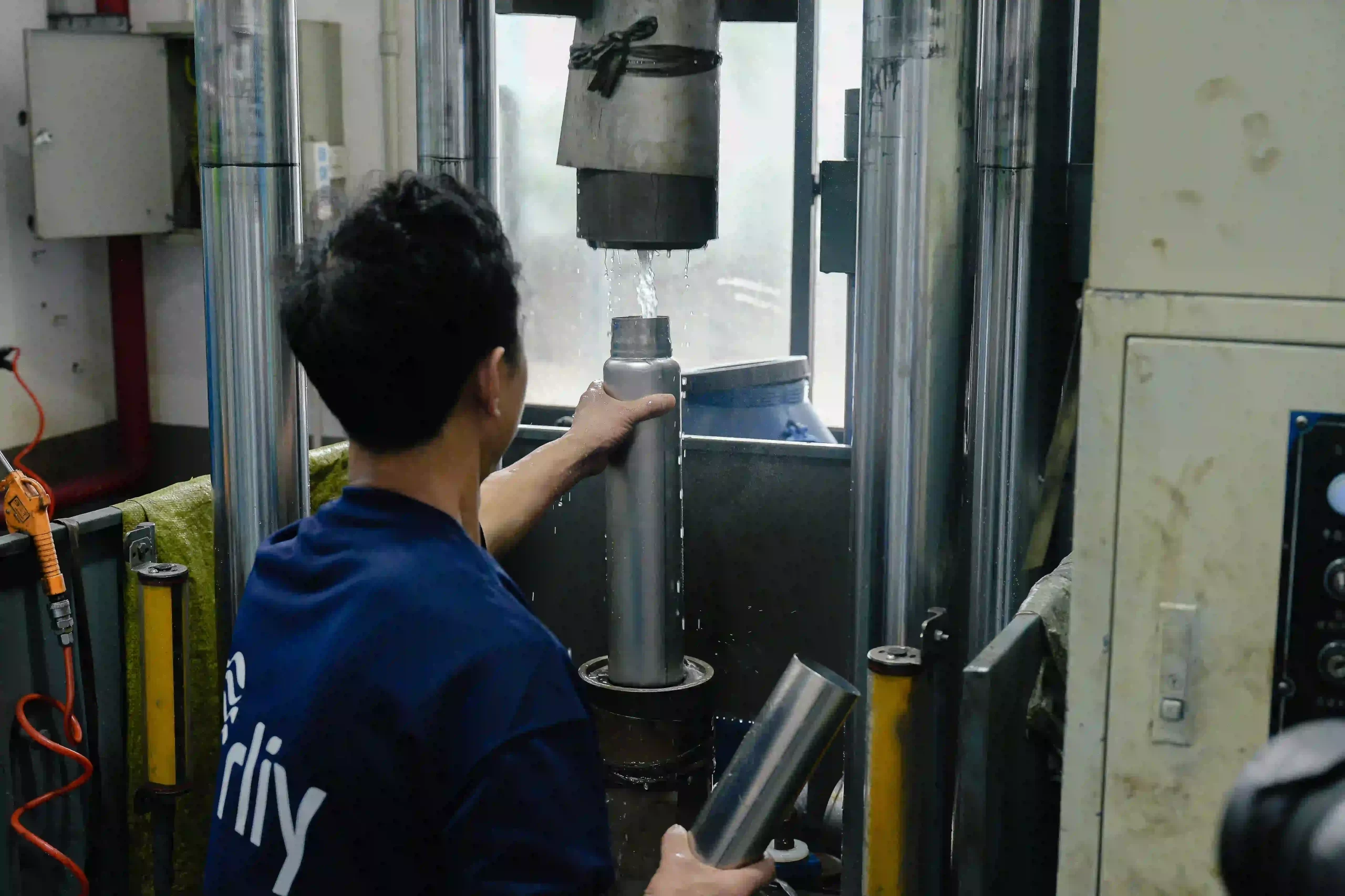
A while ago, I spent a few days at the factory.
Originally, I went there to shoot product photos and organize some content for our website. But after staying there for a while, I realized I was paying attention to something else much more than I expected:
Logo finishes.
Before this, most of what I knew about different logo techniques came from product photos, sample bottles, or conversations with our production team. I knew there were laser logos, silk print logos, and 3D logos. I knew they looked different and came with different costs.
But honestly, if you only see them in pictures, it can still be surprisingly hard to understand the real difference.
Especially for someone seeing them for the first time.
Sometimes several samples are placed side by side, and the first reaction is simply:
“They kind of look the same?”
So this time, while I was at the factory, I intentionally spent more time with them.
I picked up different samples, compared them under the light, touched them repeatedly, and stood next to the machines watching how each process was actually done.
And slowly, I realized something:
A lot of the differences are not just visual.
They’re the kind of details you only really notice when the product is in your hands.
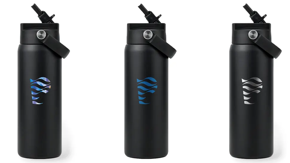
Laser Logos: Nothing Is Added — Something Is Revealed
Laser engraving was probably the process that felt the most interesting to watch in person.
Because unlike what many people imagine, the logo is not actually “printed” onto the bottle.
Instead, the bottle is first coated with paint, and then a laser precisely removes part of that coating to reveal the stainless steel underneath.
The first time I stood beside the machine watching it happen, I actually got distracted for a moment.
A beam moved quickly across the surface, and little by little, the logo started appearing from underneath the paint.
It almost felt less like “printing” and more like uncovering something that had already been there.
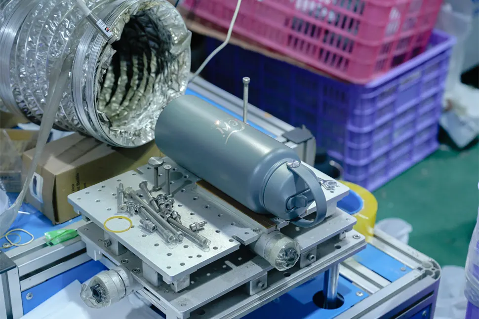
That’s also why laser logos usually feel very clean and understated.
Since the final logo is the actual stainless steel base color, it naturally carries a metallic texture and finish.
It’s not flashy.
It’s not overly decorative.
But it feels sharp in a very restrained way.
And when you touch it, the surface is almost completely flat. There’s no obvious raised texture.
A lot of minimalist, business-style, or premium-looking bottles tend to work especially well with this type of finish.
Silk Print Logos: Common, but Not “Basic”
Silk printing is probably the logo process most people are already familiar with.
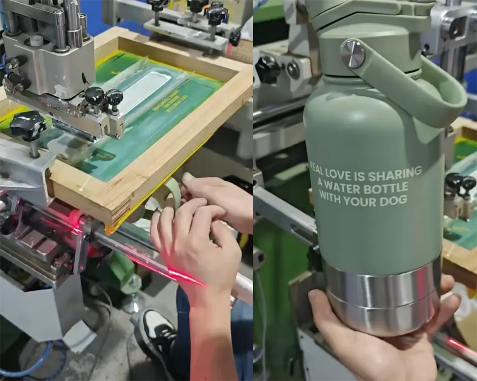
In simple terms, it involves printing ink directly onto the bottle surface.
Compared to laser engraving, the biggest advantage of silk printing is flexibility in color and graphic expression.
If a brand has a colorful logo, specific brand colors, or a design that needs to stand out visually, silk print is usually a very practical option.
While I was at the factory, I lined up several silk print samples in different colors and looked at them side by side.
And what stood out to me was how direct the visual expression feels.
The colors appear clearer.
The graphics feel more immediate.
The branding becomes more noticeable at first glance.
Because of that, this type of finish works especially well for younger, more energetic, or visually expressive brands.
I also realized something else during the visit.
A lot of people tend to assume that because silk printing is common, it must somehow feel “less premium.”
But honestly, that’s not really true.
The final feeling still depends heavily on the overall design — the bottle color, layout, proportions, finish, and how everything works together.
Some silk print logos actually look extremely clean and refined when done well.
And that’s probably why it remains one of the most widely used and mature logo techniques in the industry.
When touched, the surface has a very slight texture, but overall it still feels relatively flat.
3D Logos: The Biggest Difference Is Actually in the Touch
Before this trip, I always assumed the biggest difference with 3D logos was visual.
But after physically handling many samples myself, I changed my mind a little.
I think the biggest difference is actually tactile.
Because in photos, the gap between a regular logo and a 3D logo sometimes doesn’t look dramatic at all.
But once you actually hold the bottle and run your fingers across the logo, you immediately notice something different.
The logo feels raised from the surface.
There’s thickness.
There’s depth.
There’s a physical presence to it.
And somehow, that small detail makes the branding itself feel stronger.
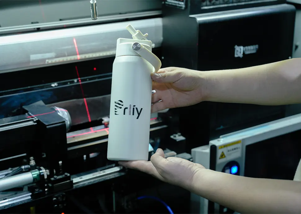
At the factory, I found myself repeatedly touching different samples over and over again (probably more times than necessary).
And after a while, I started realizing that many product details are not first noticed by the eyes.
They’re noticed by the hand.
Some finishes feel smoother.
Some feel more solid.
Some feel more integrated into the product itself.
And 3D logos tend to be the kind that people notice almost immediately once they pick the bottle up.
That’s also why they’re often popular for gift products, customized collections, or brands that want a stronger logo presence.
Why the Differences Don’t Always Show Clearly in Photos
This was another thing I understood much more clearly after visiting the factory.
A lot of customers ask questions like:
“Why do they look similar in pictures?”
“Why are the prices different?”
“How should I choose?”
But the truth is, many of these differences were never meant to exist only visually.
Logo finishes also affect:
- texture
- depth
- reflection
- surface feel
- how the product feels during everyday use
And those are things that become much more obvious once the bottle is actually in your hands.
There’s No Single “Best” Option — Only Different Brand Expressions
After spending those days at the factory, I think I started looking at these processes a little differently.
None of them are objectively “better.”
They simply express different feelings.
Laser logos feel cleaner and more restrained.
Silk print feels more flexible and visually direct.
3D logos create stronger texture and brand presence.
Different brands naturally fit different styles.
That’s also why I wanted to write this article.
Because after actually seeing these processes in person — watching them happen, touching the samples, comparing the small differences — I realized how hard it is to fully understand them through photos alone.
And hopefully, this can help more PRLIY customers better understand what kind of finish truly matches the feeling they want to create for their products.
If there are other topics about drinkware customization, materials, surface finishes, or factory production that you'd like to learn more about, feel free to reach out to us anytime.
We’ll continue sharing more of the things we genuinely see and experience behind the scenes.
Written by
Prliy
Prliy is a manufacturer focused on stainless steel drinkware, specializing in both core components and finished products. We are committed to creating bottles that perform reliably in everyday life — with a strong focus on insulation, food safety, and long-term durability.
Our products are developed and manufactured under strict, standardized, and sustainable processes, meeting multiple international food safety and environmental standards.
With years of industry experience, Prliy operates two stable production facilities in Zhejiang, China, along with an overseas warehouse in the United States. This integrated system — covering manufacturing, warehousing, and delivery — allows us to respond efficiently to customer needs while ensuring stable, long-term supply capabilities.
-
Share
-

-

-